Creating Custom Keycaps: From Inspiration to Mass Production
HeJialeiDesigning a set of keycaps is a blend of creativity, craftsmanship, and practicality. From the initial spark of an idea to the final mass-produced product, every step demands balancing visual appeal, tactile comfort, and manufacturing feasibility. Below is a guide to help you navigate this process systematically.
Defining Core Goals: Setting the Direction
Before diving into design, clarify your keycaps’ purpose to keep the project focused. Start by identifying the target keyboard layout—whether ANSI, ISO, 60%, 75%, 96%, or a custom split-spacebar design. Layouts vary drastically in keycap size and quantity: a 60% keyboard, for example, skips the F-row and numpad, requiring fewer caps, while a full-size 104-key board needs more function keys to cover all positions.
Next, consider the intended use. Are these keycaps for daily typing, where feel and readability take priority? Or are they for display, emphasizing bold visuals? Themed designs—like anime, gaming, or cultural collaborations—fall into their own category, requiring cohesive storytelling.
Finally, settle on a core style. Whether vintage, cyberpunk, minimalist, natural, or anime-inspired, extract defining elements: a “vintage typewriter” theme might call for beige bases with dark circular characters, while “cyberpunk” could lean into neon hues and glitch art patterns.

Crafting Core Elements: Refining Details
This stage turns ideas into tangible designs by honing patterns, colors, fonts, and shapes.
Aligning Patterns with Theme
Every keycap—from alpha keys to novelties—should reflect a unified theme. For an “ocean theme,” alpha keys might feature gradient blue bases, while novelty keys (like ESC or spacebar) showcase waves or whales, and F-row keys highlight anchors or coral.
Design with zones in mind: Alpha keys (letters and numbers) work best with simple solid colors, gradients, or subtle textures to avoid distracting from typing. Novelty keys (ESC, spacebar, arrow keys) can become focal points, using full-pattern prints or theme logos. Extension keys—extra caps for different layouts—should mirror this style to avoid looking out of place.
Choosing Color Schemes
Start with 1–2 primary colors, making up over 70% of the design to set the mood: think black and gray for calm, or pink and white for freshness. Add 1–2 accent colors (20–30%) to highlight characters, pattern edges, or novelties—deep blue with neon green accents, for instance, amplifies a cyberpunk vibe.
Use tools like Pantone color cards for precise factory matching, or apps like Adobe Color or Coolors to generate palettes. Remember: material affects color—PBT renders hues more “solid,” while ABS leans brighter.
Selecting Fonts and Character Placement
Prioritize readability for alpha and number keys, opting for clear fonts like Cherry’s original typeface, Helvetica, or sans-serif styles. Avoid over-stylized designs that blur small characters (common in F-rows or numpads).
Novelty keys offer more flexibility: replace text with icons (e.g., “×” for ESC or “←” for backspace) that match the theme—serif fonts for vintage looks, geometric symbols for futuristic designs. Place characters where users expect them: letters in the top-left of keys, function labels centered, to keep typing intuitive.
Picking the Right Profile
A keycap’s profile—its height and curvature—shapes feel and visual depth. Choose based on user habits:
- OEM/Cherry: The most popular, with moderate curvature, balanced feel, and broad compatibility (OEM is slightly taller than Cherry).
- SA: Tall, spherical caps with a retro typewriter aesthetic, ideal for displays but potentially straining for long typing.
- DSA: Flat, low-profile caps with uniform height, perfect for full-pattern prints and minimalist styles.
- XDA: A middle ground between DSA and OEM, with rounder curves that balance comfort and looks.
Ensure the profile matches your switches’ actuation height to prevent sticking—SA caps, for example, pair poorly with low-profile switches.
Planning Sizes and Layouts: Ensuring Fit
Keycaps must align precisely with your keyboard’s layout, where each key’s position and size follow strict rules.
Sizes are measured in “u” (1u ~ 19.05mm): Alpha, number, and symbol keys are typically 1u. Spacebars come in 6.25u (119.06mm) or 7u (133.35mm), while split-spacebar designs need smaller sizes like 2.25u or 2.75u. Left Shift keys are often 2.25u, right Shifts 2.75u; ANSI Enter keys are 2.25u (straight), while ISO uses 1.5u (curved).
To cover more layouts, design extension keys: 60%/65% boards need F-row and 1.25u/1.5u arrow key caps; split-spacebar setups require 2u–2.75u options; special layouts like Alice or ergonomic keyboards need custom-measured sizes. Reference established layouts from brands like GMK or SP to avoid missing critical dimensions.
Selecting Materials and Processes: Shaping Texture
Materials and manufacturing processes define durability, feel, and appearance—choose based on budget and design needs.
Materials
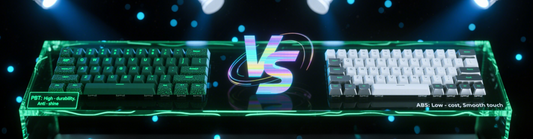
- ABS: Affordable with good RGB light transmittance but prone to surface shine over time.
- PBT: Harder, scratch-resistant, and matte—resists shine but costs more and works poorly with RGB (opt for light-colored or translucent characters).
- PC: Highly transparent, great for full-RGB designs but soft and scratch-prone.
- Special options: POM (smooth feel, rare) or resin (handmade, high-cost).
Processes for Characters and Patterns
| Process | How It Works | Benefits | Drawbacks | Best For |
| Dye-sublimation | Ink seeps into material via high heat | Fine details, long-lasting colors, no raised edges | Only dark patterns on light bases (e.g., black on white) | Complex designs, gradients, full-key prints |
| Double-shot molding | Two colored plastics injected as one | Characters never wear, strong depth | High cost, limited to 2–3 colors | Simple characters, high-durability needs (e.g., gaming) |
| Laser engraving | Laser burns away surface to reveal base color | Low cost, good for single-color designs | Patterns wear easily (especially on ABS) | Simple text, budget projects |
| Spray + laser etching | Paint first, then laser removes excess | Rich colors, moderate cost | Paint may peel over time | Medium-complexity designs, balancing cost and quality |
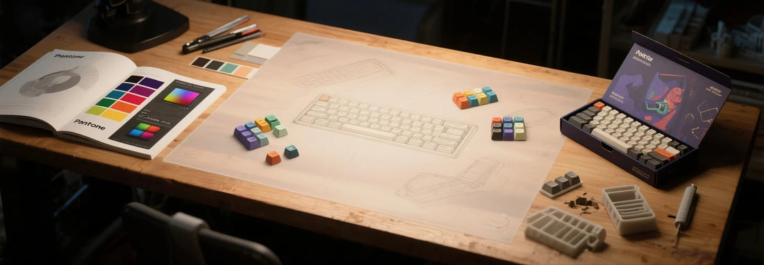
Tools and Design Finalization: Turning Ideas into Files
Use professional tools to create production-ready designs:
- 2D Tools: Photoshop for textures, Illustrator for vector characters/geometric patterns, or CorelDRAW for layout. Use Excel or CAD to map key positions, labeling sizes and patterns for factories.
- 3D Tools (Optional): Blender (free), Rhino (professional), or Keycap Designer (beginner-friendly) let you preview 3D shapes, ensuring patterns fit curved surfaces without distortion.
Design tips: Position characters intuitively (e.g., 1u keys’ text in the top-left); leave 1–2mm margins on edges to prevent pattern cropping; provide vector files (AI, CDR) for crisp enlargement.
Prototyping and Adjustment: Testing the Design
Never skip prototyping—use samples to catch issues before mass production.
Work with factories like China’s Jianjiangfang or KBDfans (small batches) or Germany’s GMK/US-based SP (specialized processes). Provide 2D/3D files, layout tables, material specs, and color codes (e.g., Pantone).
Check prototypes for color accuracy (PBT may look darker), pattern alignment, proper fit on your keyboard, and comfortable feel. Adjust designs—tweak colors, reposition patterns—and re-prototype until satisfied.
Mass Production and Beyond: Launching the Product
- Small batches: For personal use or limited sharing, order 10–50 sets post-prototype (factories often require 50–100 minimum; small runs cost more).
- Commercial production: Scale up to lower costs (1000+ sets can cut double-shot expenses by 30%). Design theme-matching packaging—kraft boxes for vintage, acrylic for cyberpunk—and sell via communities (Geekhack, Discord) or platforms (Etsy).
Protect original designs with copyright registration to prevent copying.
Finding Inspiration and Avoiding Mistakes
Draw ideas from keycap communities (Geekhack, ZFrontier) or events like ChinaJoy’s custom keyboard exhibits. Add personal touches—local dialects, niche IPs, original art—to stand out.
Pay attention to details: Ensure patterns fit each profile’s curves; keep 1u key characters uncrowded.
With this process, you’ll turn a vague idea into a functional, stylish keycap set.