Catppuccin: The Cozy Color Ecosystem Taking Digital Spaces by Storm
HeJialeiShare
In the vast universe of digital design, few projects have managed to blend aesthetics, functionality, and versatility as seamlessly as Catppuccin. What started as a passion project for color enthusiasts has evolved into a beloved open-source theme ecosystem, gracing everything from code editors to command-line tools with its warm, coffee-inspired palette. Let’s dive into what makes this color scheme so special.
A Philosophy Brewed with Care
At its core, Catppuccin is built on a simple yet powerful belief: color should serve both form and function. The creators rejected the extremes of low-contrast minimalism (which often sacrifices readability) and high-contrast vibrancy (which can strain the eyes over time). Instead, they crafted a middle ground where colors work harmoniously to organize information while remaining easy on the eyes.
This approach stems from a deeper understanding of visual cognition—bright, distinct hues help the brain parse complex structures, whether you’re scanning lines of code or navigating a cluttered interface. Catppuccin doesn’t just make things look pretty; it makes them make sense.
Four Flavors, Endless Possibilities
Catppuccin’s most iconic feature is its four "flavors," each inspired by a coffee drink and tailored to different lighting preferences:
- Latte: A light, airy palette with soft pastels, perfect for bright environments or users who prefer a clean, minimalist look.
- Frappé: A muted, desaturated take on the theme, striking a balance between light and dark for versatile use.
- Macchiato: A richer, warmer variation with deeper tones that pop against medium backgrounds.
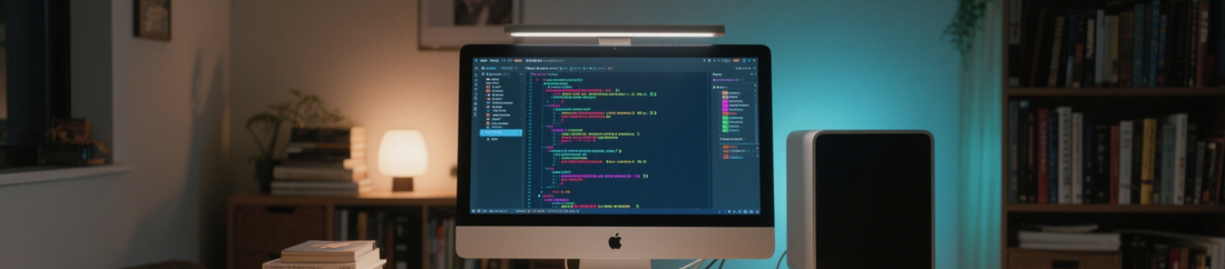
- Mocha: The darkest option, featuring bold colors against a deep base—ideal for late-night coding sessions or low-light setups.
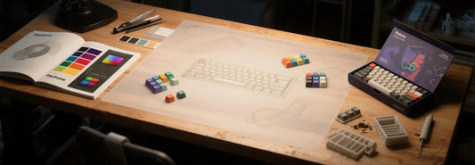
Each flavor comes with 26 carefully calibrated colors, from primary accents to subtle highlights, ensuring consistent distinction between UI elements. And for those who crave uniqueness, Catppuccin offers tools to craft custom flavors, with compiled configurations that keep performance snappy.
Everywhere You Look
What truly sets Catppuccin apart is its omnipresence. This isn’t just a theme for one app—it’s a design language that spans platforms:
- Code editors: Neovim, VS Code, Sublime Text, and more.
- Command-line tools: Terminal emulators, Git clients, and shell prompts.
- Operating systems: Custom themes for Windows, macOS, and Linux desktops.
- Productivity apps: Notion, Obsidian, and even email clients.
This cross-compatibility means you can immerse yourself in a cohesive visual experience, whether you’re debugging code, writing notes, or browsing the web.
Brewed by the Community
Catppuccin thrives because of its dedicated community. A global team of designers and developers contributes to its growth, refining color values, adding new app support, and helping users troubleshoot. This collaborative spirit ensures the theme stays fresh, with regular updates that adapt to new software trends.
For newcomers, the community offers extensive documentation, tutorials, and a vibrant Discord server where ideas flow as freely as coffee. Whether you’re a developer wanting to port Catppuccin to your favorite tool or a user seeking setup tips, you’ll find support around every corner.
Why It Matters
In a world of generic interfaces, Catppuccin reminds us that design can be both intentional and joyful. It proves that a well-chosen color scheme isn’t just decoration—it’s a tool that enhances focus, reduces eye strain, and makes digital spaces feel like home.
So whether you’re a coder chasing the perfect editor theme, a designer hunting for harmonious color inspiration, or just someone who appreciates a little warmth in their apps, Catppuccin invites you to pour yourself a cup and stay a while.
After all, good design—like good coffee—tastes better when shared.