
Catppuccin vs Nord: Which Theme Fits Your Setup?
Petit Keycaps
Catppuccin and Nord both make dark workspaces feel calmer, but they arrive there by different routes. Catppuccin Mocha uses a deep purple-gray base with a broad family of pastel accents. Nord builds its identity around cool blue-grays, icy cyan, and a smaller group of aurora-inspired colors.
The short answer: choose Catppuccin if you want four coordinated brightness levels, more accent choices, and a layered pastel desktop. Choose Nord if you prefer a restrained arctic palette, fewer visual decisions, and a clean blue-gray interface. Neither is automatically easier on every pair of eyes, so the best choice depends on how each port renders your real code.

Catppuccin vs Nord at a glance
| Feature | Catppuccin | Nord |
|---|---|---|
| Core look | Pastel accents on purple-tinted layered surfaces | Muted arctic blues with restrained aurora accents |
| Main dark option | Mocha | Polar Night-based dark themes |
| Palette structure | 26 named colors in each of four flavors | 16 numbered colors in four functional groups |
| Background | Mocha Base #1e1e2e
|
Nord0 #2e3440
|
| Accent behavior | Many soft accents can share attention | Cool accents dominate; warm colors appear selectively |
| Best fit | Flexible full-desktop theming and day/night switching | Minimal, consistent dark setups with a cool atmosphere |
The biggest difference: pastel variety vs arctic restraint
Catppuccin Mocha feels colorful even when the interface is quiet. Mauve, Lavender, Blue, Sapphire, Teal, Green, Yellow, Peach, Maroon, and Red give theme authors many ways to separate syntax roles. Nine surface colors also help sidebars, tabs, selections, popovers, and inactive panes sit at different depths.
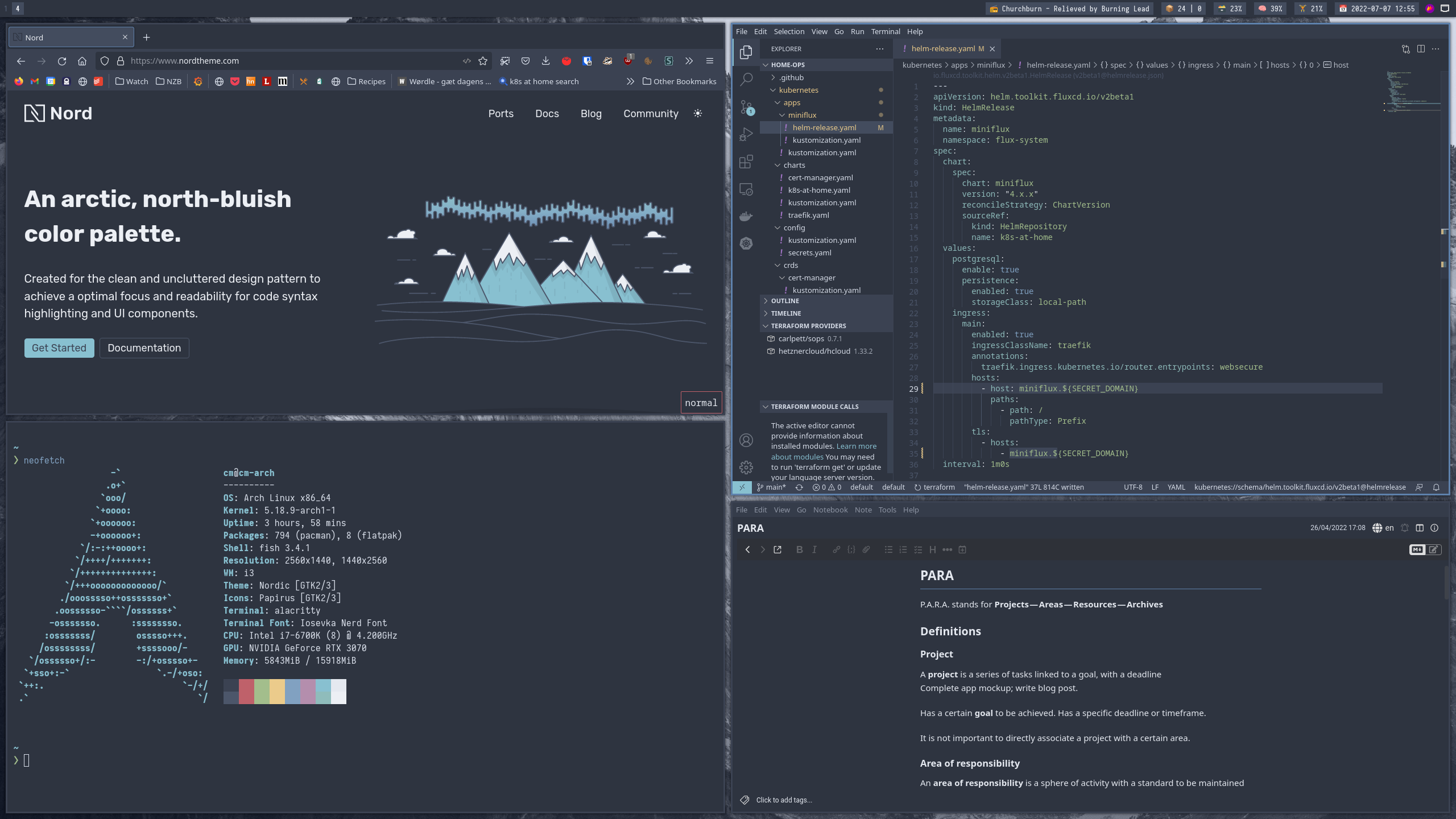
Nord is more compact. Its 16 colors are divided into Polar Night, Snow Storm, Frost, and Aurora. Polar Night supplies the dark blue-gray backgrounds; Snow Storm supplies light foregrounds; Frost carries the signature blue and cyan accents; Aurora reserves warmer red, orange, yellow, green, and purple for semantics that need attention.
Catppuccin makes room for more color relationships. Nord makes a smaller set of relationships feel deliberate.
A Catppuccin port can distinguish several adjacent surfaces without leaving the palette. A Nord port often feels flatter and more unified. If you prefer fewer borders and less visual layering, Nord's restraint may feel cleaner. If you want tabs, panels, and floating windows to be clearly tiered, Catppuccin provides more neutral steps.
Color palette comparison
| Role | Catppuccin Mocha | Nord |
|---|---|---|
| Background |
#1e1e2e Base |
#2e3440 nord0 |
| Primary text |
#cdd6f4 Text |
#d8dee9 nord4 |
| Blue |
#89b4fa Blue |
#81a1c1 nord9 |
| Cyan/teal |
#94e2d5 Teal |
#88c0d0 nord8 |
| Purple |
#cba6f7 Mauve |
#b48ead nord15 |
| Warm accent |
#fab387 Peach |
#d08770 nord12 |
Nord's base is lighter and bluer than Catppuccin Mocha's. Its foreground is also more neutral. Catppuccin's accents lean sweeter and more varied, while Nord's Frost family keeps the dominant impression cool. For all Catppuccin values and roles, see our Catppuccin hex palette chart.
Variants and brightness choices
Catppuccin treats brightness as a first-class choice. Latte is light, Frappé is a muted dark flavor, Macchiato is deeper, and Mocha is the darkest. The names and roles remain consistent across all four, so switching flavor does not require learning a new syntax language.
Nord's official palette includes colors intended for dark and bright ambiences, but most familiar editor implementations focus on its signature dark appearance. Individual community ports may add lighter or higher-contrast variants, yet those options are not as uniform across the ecosystem as Catppuccin's four flavors.
If you switch themes automatically at sunrise and sunset, Catppuccin is easier to keep consistent. If you live in dark mode and want one recognizable visual identity, Nord's narrower target can be a strength.
Readability during long coding sessions
Both themes avoid pure black and pure white, reducing the harshest possible contrast. Nord's cool background and restrained syntax can make a crowded file feel orderly. Catppuccin spreads distinction across more hues, which can make deeply nested or semantically rich code easier to scan without making every token bright.
The tradeoff appears in secondary information. Nord ports may use muted blue-gray for comments and inactive UI, while Catppuccin ports often use Overlay or Subtext colors. On a low-quality display, either can become too faint. Semantic highlighting, font weight, italics, transparency, and ambient light can matter more than the palette's headline colors.
Test each theme with the same font, brightness, and project. Check comments, diagnostics, diffs, search results, selections, and inactive tabs—not just a colorful sample file. For VS Code, our Catppuccin VS Code setup guide provides a clean baseline for the comparison.
Editors, terminals, and ecosystem fit
Both projects extend across editors, terminals, shells, browsers, and desktop tools. Catppuccin's centrally defined flavors and color names make cross-app coordination unusually predictable. Nord's long-running port ecosystem and simple 16-color vocabulary make it easy to reproduce in terminals, status bars, and minimal window-manager setups.
Do not choose by total port count alone. Check the exact applications you use, when each port was last maintained, and whether it supports the variants you want. A polished Nord port is better than an incomplete Catppuccin port, and the reverse is equally true.
Which theme should you choose?
Choose Catppuccin if:
- You want several light-to-dark flavors with consistent color roles.
- You enjoy lavender, pink, peach, teal, and blue sharing the interface.
- You prefer visibly layered tabs, panels, and floating surfaces.
- You want to coordinate a broad desktop and physical desk setup.
Choose Nord if:
- You want a compact, memorable 16-color system.
- You prefer cool blue-gray backgrounds and restrained syntax.
- You like clean, flat interfaces with fewer competing accents.
- You mostly use dark mode and do not need four standardized variants.
Catppuccin vs Nord FAQ
Is Catppuccin darker than Nord?
Catppuccin Mocha Base at #1e1e2e is darker than Nord's common nord0 background at #2e3440. Catppuccin Frappé and Macchiato offer lighter dark options, so the practical answer depends on the flavor and port.
Does Nord have a light theme?
Nord's palette documentation supports bright ambience designs, but light implementations are less standardized across ports than Catppuccin Latte. Confirm that your specific Nord port includes a maintained light variant.
Which theme has more colors?
Catppuccin defines 26 named colors per flavor, while Nord defines 16 numbered colors. More colors do not guarantee better readability; they give theme authors more neutral layers and accent choices.
Which is better for a full desk theme?
Catppuccin offers more ready-made pastel coordination for wallpapers, accessories, and keycaps. Nord produces a cleaner arctic setup centered on blue-gray, cyan, white, and selective aurora colors.
Final verdict
Pick Catppuccin for flexible flavors, layered surfaces, and a broad pastel vocabulary. Pick Nord for an arctic, uncluttered identity built from a disciplined 16-color palette. If you remain undecided, compare Catppuccin Macchiato with Nord first: their brightness is close enough that the real difference—pastel variety versus cool restraint—becomes easier to judge.
Palette values and project descriptions were checked against the official Catppuccin palette and official Nord documentation. Port behavior varies by application.