
Catppuccin vs Rosé Pine: Which Theme Fits Your Setup?
Petit Keycaps
Catppuccin and Rosé Pine sit close together in the theme landscape. Both favor tinted backgrounds, soft contrast, memorable purple-pink accents, and coordinated light and dark variants. Yet their moods are different: Catppuccin feels playful and expansive, while Rosé Pine feels earthy, elegant, and deliberately limited.
Choose Catppuccin if you want four brightness levels, more accent colors, and a highly structured UI palette. Choose Rosé Pine if you want a smaller, warmer color language with three variants and a distinctive rose-gold-pine identity.

Catppuccin vs Rosé Pine at a glance
| Feature | Catppuccin | Rosé Pine |
|---|---|---|
| Core look | Playful pastels on layered tinted surfaces | Muted natural hues with rose, gold, and pine accents |
| Variants | Latte, Frappé, Macchiato, Mocha | Rosé Pine, Moon, Dawn |
| Named colors | 26 per flavor | 15 per variant |
| Deep dark base | Mocha #1e1e2e
|
Rosé Pine #191724
|
| Accent style | Wide spectrum of related pastels | Focused set of organic, elegant accents |
| Best fit | Flexible ecosystems and clearly layered interfaces | Minimal, cohesive workspaces with a refined mood |
The biggest difference: abundance vs curation
Catppuccin offers 14 accent colors plus foreground and surface ramps. That range gives a theme author separate colors for many syntax categories while preserving a consistent pastel character. It also gives interfaces nine surface colors for tabs, sidebars, overlays, selections, and borders.
Rosé Pine uses 15 colors in total. Six accents—Love, Gold, Rose, Pine, Foam, and Iris—carry most of the expressive work. Base, Surface, Overlay, Muted, Subtle, Text, and three highlight colors handle the interface. The result is less rainbow-like and more curated.
Catppuccin is a complete pastel toolkit. Rosé Pine is a tightly edited color story.
If you like identifying syntax roles by many different hues, Catppuccin may be faster to scan. If too many colors make code feel busy, Rosé Pine's smaller vocabulary can create a more composed page.
Color palette comparison
| Role | Catppuccin Mocha | Rosé Pine |
|---|---|---|
| Background |
#1e1e2e Base |
#191724 Base |
| Primary text |
#cdd6f4 Text |
#e0def4 Text |
| Pink/red |
#f38ba8 Red |
#eb6f92 Love |
| Warm accent |
#f9e2af Yellow |
#f6c177 Gold |
| Blue/cyan |
#89b4fa Blue |
#9ccfd8 Foam |
| Purple |
#cba6f7 Mauve |
#c4a7e7 Iris |
Rosé Pine's original Base is darker than Catppuccin Mocha, but its Text is lighter. That gives the primary foreground a firmer edge while keeping accents muted. Catppuccin's broader blue-green range and extra neutrals make the interface feel more graduated. Explore the full Catppuccin system in our hex palette reference.
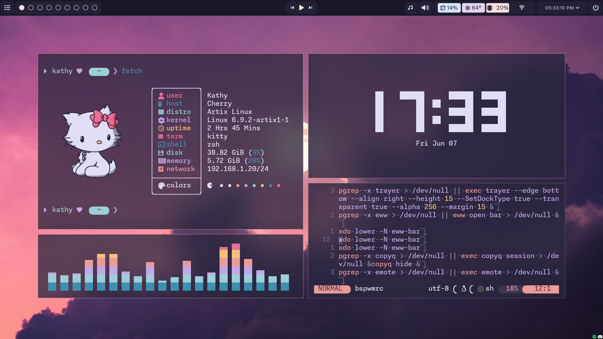
Four flavors vs three variants
Catppuccin moves from Latte to Frappé, Macchiato, and Mocha. The two middle dark flavors are useful when Mocha feels too deep but a light theme is not appropriate. Each flavor preserves all 26 color names.
Rosé Pine offers the original dark variant, the slightly lighter and cooler Moon, and the light Dawn. The family covers the essential day/night range with one fewer intermediate choice. Moon is often the fairest comparison with Catppuccin Macchiato; the original Rosé Pine competes more directly with Mocha.
Both systems make automatic day/night switching straightforward. Catppuccin wins on granularity; Rosé Pine wins on simplicity.
Readability and coding comfort
Catppuccin can separate many token types without relying only on brightness. Its accents remain relatively soft, but a language with rich semantic highlighting may still look colorful. Rosé Pine uses fewer accents and allows more tokens to share a visual family, producing a calmer but sometimes less differentiated file.
Comments and inactive interface elements deserve special attention. In both themes, muted colors can be beautiful on a high-quality display and too faint on a washed-out one. Test at your normal brightness with your preferred font. Look at comments, punctuation, inline hints, diagnostics, git diffs, and selected text.
For a controlled editor test, install Catppuccin using our VS Code setup guide, then compare it with Rosé Pine using the same file and semantic-highlighting settings.
Ecosystem and full-desktop consistency
Both communities maintain ports for popular editors, terminals, command-line tools, and desktop applications. Catppuccin's ecosystem is larger and its four-flavor contract is particularly useful when several apps need matching light and dark modes. Rosé Pine's ports carry a strong editorial identity and its smaller palette is easy to reproduce in custom status bars, terminal prompts, and wallpapers.
Maintenance quality matters more than the number of logos on a project page. Confirm that the port for each critical application supports the variant and syntax features you need.
Which theme should you choose?
Choose Catppuccin if:
- You want four standardized brightness levels.
- You enjoy a larger spectrum of pastel syntax colors.
- You want many neutral steps for layered application UI.
- You need consistent ports across a wide toolchain.
Choose Rosé Pine if:
- You prefer rose, gold, pine, foam, and iris over a broad rainbow.
- You want a darker, more editorial atmosphere.
- You value a compact palette that is easy to customize.
- You want dark, softer-dark, and light choices without extra decisions.
Catppuccin vs Rosé Pine FAQ
Which theme is darker?
The original Rosé Pine Base at #191724 is darker than Catppuccin Mocha Base at #1e1e2e. Perceived contrast also depends on foreground colors and the application port.
Does Rosé Pine have a light theme?
Yes. Rosé Pine Dawn is the official light variant. Catppuccin's equivalent is Latte.
Which theme is more colorful?
Catppuccin generally appears more colorful because it defines 14 accents. Rosé Pine's six accents create a more tightly controlled visual rhythm.
Which is better for a pink or purple desk setup?
Catppuccin gives you more lavender and pastel combinations, while Rosé Pine creates a richer plum-and-rose mood with gold and teal-green contrast.
Final verdict
Pick Catppuccin for variety, flexible brightness, and richly layered pastel interfaces. Pick Rosé Pine for a darker, more curated workspace built around a memorable natural palette. If both appeal, test Catppuccin Macchiato against Rosé Pine Moon first; they reveal the philosophical difference without letting raw darkness dominate the result.
Palette names and values were checked against the official Catppuccin palette and official Rosé Pine palette.